Exploratory Analysis
Load packages and import datasets.
library(ggridges)
library(tidyverse)
library(plotly)
library(gridExtra)

combine_df = read_csv("data/combine.csv")

combine_tc_binary = read_csv("data/combine.csv") |>
  mutate(
    total_cholesterol = case_when(
      total_cholesterol < 200 ~ "desirable",
      total_cholesterol >= 200 ~ "above desirable",
      TRUE ~ as.character(total_cholesterol)
    )
  )
Ditribution of Total Cholesterol
TC_distri = ggplot(combine_df, aes(x = total_cholesterol)) +
  geom_histogram(fill = "skyblue", color = "black", alpha = 0.7) +
  labs(
    x = "Total Cholesterol",
    y = "Frequency",
    title = "Distribution of Total Cholesterol"
  ) +
  theme_minimal()

ggplotly(TC_distri)
The presented data illustrates the distribution of
Total Cholesterol, spans from a minimum of 71 mg/dL to a
maximum of 446 mg/dL. The interquartile range, which captures the
central 181 of the data, extends from 156 mg/dL (25th percentile) to 210
mg/dL (75th percentile), with the median falling at 181 mg/dL. It
reveals a notable right-skewed graph. This skewness is
indicative of a pronounced prevalence of participants whose cholesterol
levels are concentrated within the range of 130 to 200 mg/dL.
According to CDC, high
cholesterol is defined as total cholesterol level greater than 200mg/dL.
Therefore, we use this value to categorize into a binary variable,
Total Cholesterol Cat with 2 levels: “desirable” (at most
200mg/dL) and “above desirable” (higher than 200mg/dL) in the following
analysis.
Sleep Hours & Total Cholesterol
sleep_hour_distri = ggplot(combine_df, aes(x = sleep_hour)) +
  geom_histogram(binwidth = 1, fill = "skyblue", color = "black", alpha = 0.7) +
  labs(title = "Distribution of Sleep Hours",
       x = "Sleep Hours",
       y = "Frequency") +
  theme_minimal()

ggplotly(sleep_hour_distri)
The distribution of Sleep Hours depicted above exhibits
characteristics consistent with a normal distribution,
showcasing a bell-shaped curve. This normal distribution suggests that
the majority of individuals in the sample population tend to obtain
approximately 7 to 8 hours of sleep per night in weekdays. The peak of
the curve is centered around this range, indicating a prevalent and
typical sleep duration among the surveyed participants.
TC_sleep =
  plot_ly(combine_tc_binary, x = ~total_cholesterol, y = ~sleep_hour, color = ~total_cholesterol, type = "box", colors = "viridis") |>
  layout(title = "Total Cholesterol & Sleep Hours",
         xaxis = list(title = "Total Cholesterol"),
         yaxis = list(title = "Sleep Hours"))

TC_sleep
The presented boxplot visually represents the
distribution of Sleep Hours in conjunction with
Total Cholesterol Cat, revealing a remarkable similarity in
distribution patterns between the group categorized as “desirable” and
those classified as “above desirable”. This observation suggests that
individuals within both categories exhibit comparable trends in sleep
duration.
Physical Activity & Total Cholesterol
combine_tc_binary =
  combine_tc_binary |>
  drop_na(physical_activity)

TC_activity = ggplot(combine_tc_binary, aes(x = physical_activity, fill = total_cholesterol)) +
  geom_bar(position = "stack") +
  scale_fill_brewer(palette = "lightgray") +
  labs(
    x = "Physical Activity",
    y = "Frequency",
    fill = "Total Cholesterol",
    title = "Relationship between Physical Activity and Total Cholesterol"
  ) +
  theme_minimal()

ggplotly(TC_activity)
The above bar chart illustrates the association
between Physical Activity and
Total Cholesterol Cat. It reveals that the majority of
individuals engage in vigorous physical activity. Surprisingly, the
prevalence of individuals with Total Cholesterol groups above the
desirable range remains consistent across three distinct levels of
Physical Activity.
Alchohol Use & Total Cholesterol
combine_tc_binary =
  combine_tc_binary %>%
  drop_na(alcohol_use_cat) %>%
  mutate(alcohol_use_cat = factor(alcohol_use_cat, levels=c("Light Drinker", "Moderate Drinker", "Heavy Drinker")))


Al_distri = ggplot(combine_tc_binary, aes(x =  alcohol_use_cat)) +
  geom_bar(fill = "skyblue", color = "black", alpha = 0.7) +
  labs(
    x = "Drinking Habits",
    y = "Count",
    title = "Distribution of Drinking Habits"
  ) +
  theme_minimal()

ggplotly(Al_distri)
The people who drink less than 11 times last year are defined as ” light drinker”, the people who drink once a month to twice a week are defined as ” moderate drinkers”, the people who drink more than twice a week are defined as ” heavy drinkers”. The distribution of drinking habits is a right skewed one, with more than 3000 people are “light drinker”, around 2500 people are “moderate drinker”, and around 1000 people are heavy drinker.
combine_tc_binary %>%
  group_by(alcohol_use_cat,total_cholesterol) %>%
  summarise(N = n()) %>%
  mutate (Proportion = N/sum(N),
          ) %>%
  plot_ly (x=~alcohol_use_cat, y= ~ Proportion * 100, type = "bar", color = ~total_cholesterol) %>%
  layout(barmode = "stack",
         title = "Distribution of High Total Cholersterol by Drinking Habits",
         xaxis = list(title = "Drinking Habits"),
         yaxis = list(title = "Percentage (%)")
         )
According to the graph, the percentage of high cholesterol increase as people drink more. 30% of light drinkers have high cholesterol while 40% of heavy drinkers have high cholesterol level.
Serum Cotinine & Total Cholesterol
According to CDC, the cutoff of cotinine for smoker and nonsmoker is 10ng/ml. The serum cotinie level in smoker distribute like this :
combine_tc_binary =
  combine_tc_binary %>%
  mutate(smoking_status_bi = ifelse(cotinine > 10, "Smoker", "Nonsmoker"),
         smoking_status_bi = factor(smoking_status_bi, levels = c("Nonsmoker","Smoker")))

combine_tc_binary_Smoker =
    combine_tc_binary %>%
    filter (smoking_status_bi == "Smoker") %>%
    ggplot (aes(x= cotinine)) +
    geom_density() +
    labs (title = "Serum Cotinine Value in Smoker",
          x="Cotinine")

combine_tc_binary_Nonsmoker =
    combine_tc_binary %>%
    filter (smoking_status_bi == "Nonsmoker") %>%
    ggplot (aes(x= cotinine)) +
    geom_density() +
    labs (title = "Serum Cotinine Value in Nonsmoker",
          x=" Cotinine")

grid.arrange(combine_tc_binary_Smoker, combine_tc_binary_Nonsmoker, ncol = 2)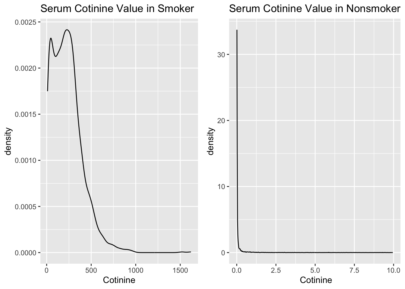
The cotinine level is a left-skew line in smokers, and it is centered around 0.00 ng/ml in non-smokers.
combine_tc_binary  %>%
  group_by(smoking_status_bi,total_cholesterol) %>%
  summarise(N = n()) %>%
  mutate (Proportion = N/sum(N),
          ) %>%
  plot_ly (x=~smoking_status_bi, y= ~ Proportion * 100, type = "bar", color = ~total_cholesterol) %>%
  layout(barmode = "stack",
         title = "Distribution of High Total Cholersterol by Smoker and Nonsmoker",
         xaxis = list(title = "Smoking Status"),
         yaxis = list(title = "Percentage (%)")
         )
According to the graph, the proportions of total cholesterol level in smoker and non-smoker are almost the same.